State Department Reverts to Times New Roman, Citing 'Wasteful' Calibri in Broader Administrative Shift
Washington D.C. — In a move underscoring a broader push to recalibrate federal administrative standards, Secretary of State Marco Rubio has mandated the immediate return to Times New Roman as the standard typeface for all official State Department communications, effectively ending the use of Calibri. The directive, issued on December 9, reverses a Biden administration policy that had adopted Calibri to enhance accessibility. Rubio characterized the previous font change as "wasteful," "informal," and a byproduct of misguided Diversity, Equity, Inclusion, and Accessibility (DEIA) initiatives, prompting both support for a return to traditional formality and criticism regarding the impact on accessibility.
The decision highlights a tension between modern accessibility concerns and a desire for what some officials describe as a more professional and traditional presentation in diplomatic documents. While seemingly a minor aesthetic adjustment, the font change has ignited debate over governmental priorities, the role of DEIA programs, and the very perception of official correspondence on a global stage.
The New Mandate: A Return to Tradition
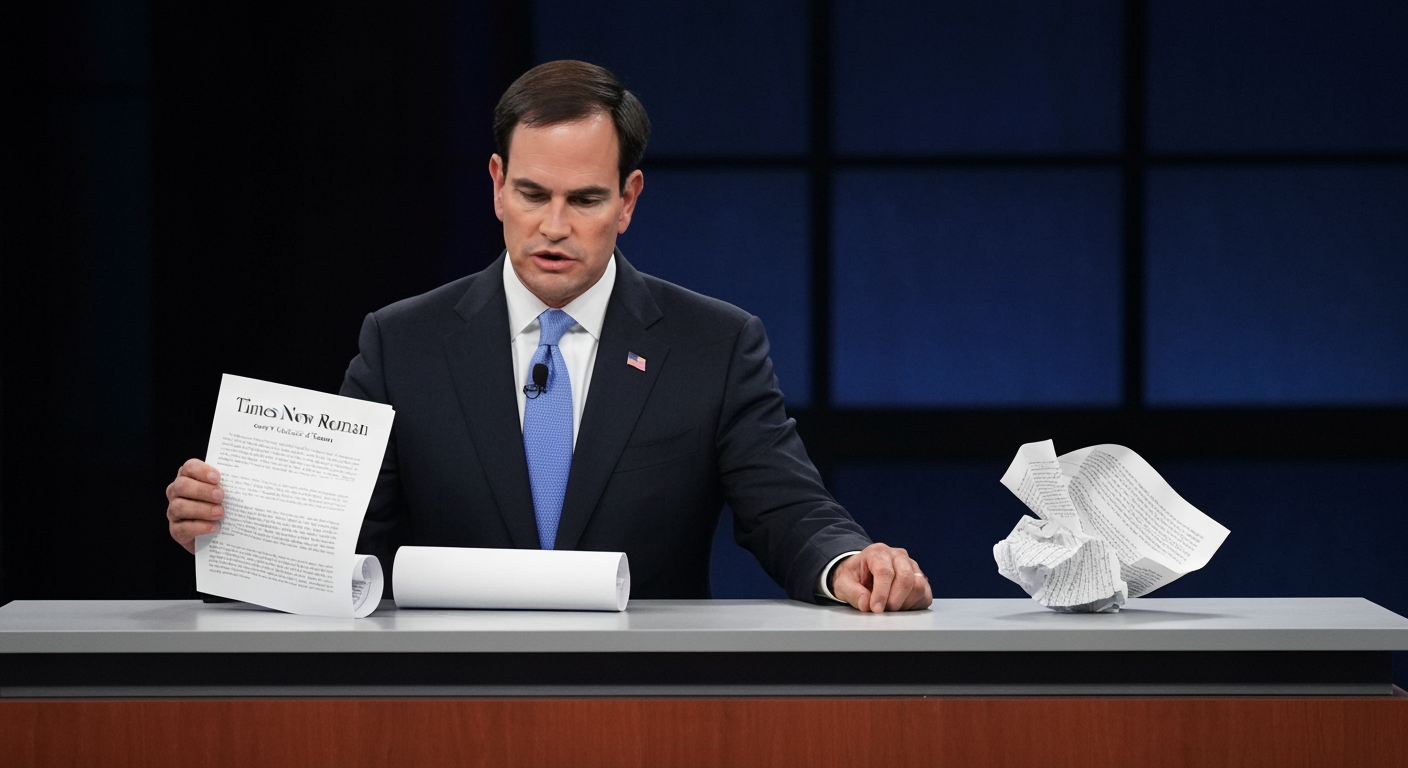
Secretary Rubio's order, communicated through an internal cable titled "Return to Tradition: Times New Roman 14-Point Font Required for All Department Paper," instructed U.S. diplomatic posts worldwide to adopt Times New Roman at a 14-point size. Rubio, who currently serves in multiple capacities including Secretary of State, interim National Security Advisor, and acting Archivist for the National Archives and Records Administration, argued that the shift would "restore decorum and professionalism to the Department's written work products."
Rubio's memo explicitly criticized the outgoing Calibri typeface, describing it as "wasteful, confusing, and unfit for the dignity of U.S. government documents." He further contended that the prior switch to Calibri had "achieved nothing except the degradation of the department's official correspondence" and that its appearance clashed with the department's existing letterhead. The Secretary's directive emphasizes that typography plays a crucial role in how official documents are perceived, influencing cohesion, professionalism, and formality, aligning with the "President's One Voice for America's Foreign Relations directive."
The Accessibility Rationale Behind Calibri
The policy now being reversed was implemented in January 2023 by Rubio's predecessor, former Secretary of State Antony Blinken. Blinken's administration had adopted Calibri based on recommendations from the State Department's Office of Diversity and Inclusion, an office that Rubio has since abolished. The primary motivation for the switch was to enhance accessibility, particularly for individuals with visual impairments, dyslexia, and those relying on screen readers.
Sans-serif fonts like Calibri are generally regarded as easier to read on digital screens due to their clean lines and lack of decorative strokes, known as serifs. Experts and accessibility advocates had suggested that these characteristics could improve legibility for a wider audience, especially in the context of increasing digital communication. The designer of Calibri, Lucas de Groot, developed the typeface with rounded forms specifically for readability on computer screens, and it replaced Times New Roman as the default font in Microsoft Office in 2007.
A Broader Reversal of DEIA Initiatives
Rubio's font directive is framed within a wider administrative effort by the current Trump administration to dismantle Diversity, Equity, and Inclusion (DEIA) programs across federal agencies. Since taking office, Rubio has systematically rolled back various DEI initiatives within the State Department and its overseas missions. The Secretary's cable acknowledged that while the switch to Calibri might not have been among the "most illegal, immoral, radical or wasteful instances of DEIA," it was nonetheless a "cosmetic" and ineffective measure.
This overarching strategy aims to return to what the administration describes as "merit-based standards" and an emphasis on "classical" aesthetics in government. The choice of Times New Roman, a serif font rooted in Roman antiquity, is presented as embodying "tradition, formality and ceremony," reflecting a desire to project a specific image of gravity and professionalism in U.S. foreign relations.
Reactions and Implications
The reversal has elicited varied responses. Lucas de Groot, the Dutch designer of the Calibri typeface, expressed a blend of "sadness" and "hilarity" at Rubio's decision, noting the original intent of Calibri for screen readability. Online, the news sparked widespread, often satirical, reactions, with many observers questioning the prioritization of font choices amidst pressing national and international issues.
Accessibility advocates have voiced concerns that reverting to Times New Roman could create barriers for individuals with visual disabilities, despite Rubio's assertion that the Calibri switch did not lead to a decline in "accessibility-based document remediation cases." The debate over the readability of serif versus sans-serif fonts continues, with different studies and experts offering varying perspectives on which style is truly more accessible across diverse user needs.
Historically, Times New Roman has been a prevalent choice for official documents, including in legal contexts and U.S. government publications, conveying a sense of authority and seriousness. Before 2004, the State Department used Courier New, later switching to Times New Roman before Blinken's 2023 change. The current administration's emphasis on uniformity and traditional presentation appears to prioritize this established aesthetic over the modern accessibility considerations that drove the previous policy.
Conclusion
The directive from Secretary of State Marco Rubio to reinstate Times New Roman in official State Department communications transcends a mere typographical preference. It is deeply embedded in a broader ideological and administrative contest concerning the future direction of U.S. government policy. By branding the use of Calibri as "wasteful" and tying it to broader critiques of DEIA programs, the administration underscores a pivot towards traditional aesthetics and away from recent initiatives focused on inclusivity. While proponents champion this as a restoration of decorum and professionalism, critics contend it overlooks demonstrable accessibility benefits for a significant portion of the population. This seemingly small shift in font choice ultimately serves as a tangible symbol of a larger administrative philosophy, with implications extending to how the United States projects its image and values both internally and on the world stage.
Sources
Related Articles

Vatican on Brink of Schism as Pope Leo XIV Issues Final Plea to Breakaway Traditionalists
VATICAN CITY – The Catholic Church stands at a critical juncture as Pope Leo XIV has issued a final, urgent appeal to the traditionalist Society of Saint Pius X (SSPX) to halt its planned consecration of four new...

India-US Trade Deal on the Brink of Breakthrough, Envoy Declares
Washington, D.C. - A significant trade agreement between the United States and India is reportedly on the cusp of completion, with a breakthrough potentially just days away, according to the US Ambassador to India,...


Congress Chief Ajay Rai Claims 'Arrest' in Ayodhya Amidst Escalating Ram Temple Embezzlement Row
AYODHYA, India – Uttar Pradesh Congress Committee chief Ajay Rai claimed he was "arrested" by police in Ayodhya on Tuesday, June 30, 2026, as he attempted to lead a party delegation to offer prayers at the Ram...